
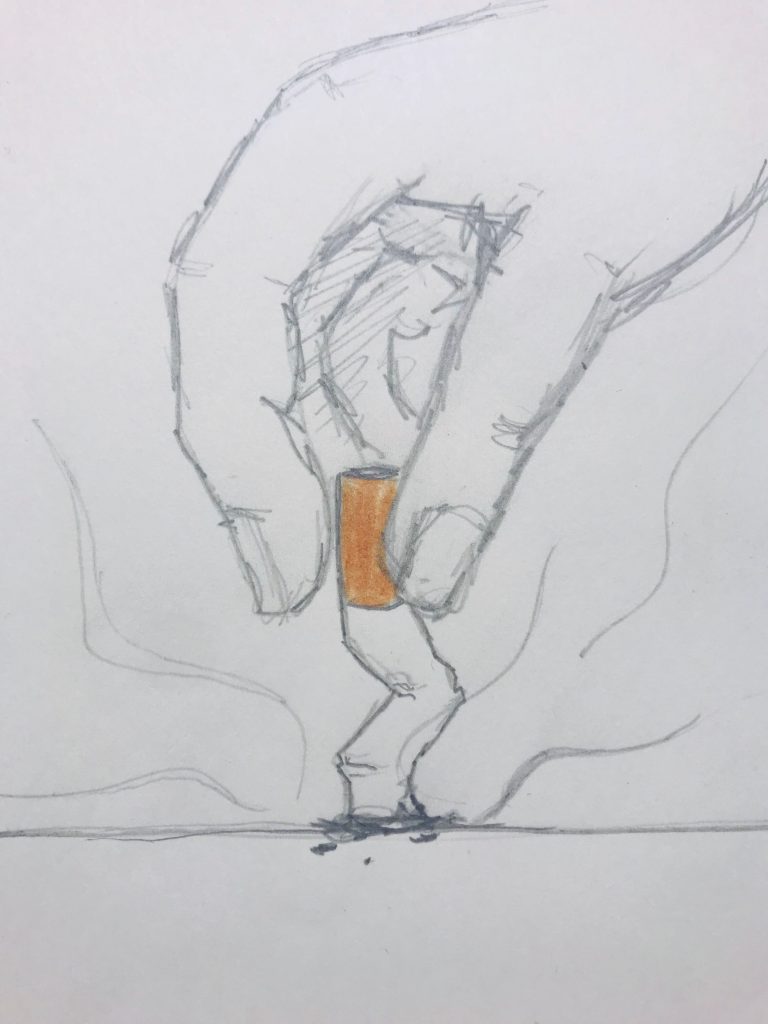
After reading the article “How Millennials Became The Burnout Generation” In the beginning of the process, I came out with three different ideas of the cover design which are two sketches and photography work. For the first striking image, striking is presenting people now are being burnt out and stressed out. The second one with a cigarette I want to show a lot of people now are smoking cigarettes because of the stressed or feeling down and the world that we are living now there is no other way to change the pressure. For the last one with photography, I want to use paper to represent a person. Each of us created our life by ourselves, we have chosen either make it better or damage it. However, the paper is the best object to symbolize human because we can be created a successful piece or damage it.
Processed with VSCO with b5 preset 
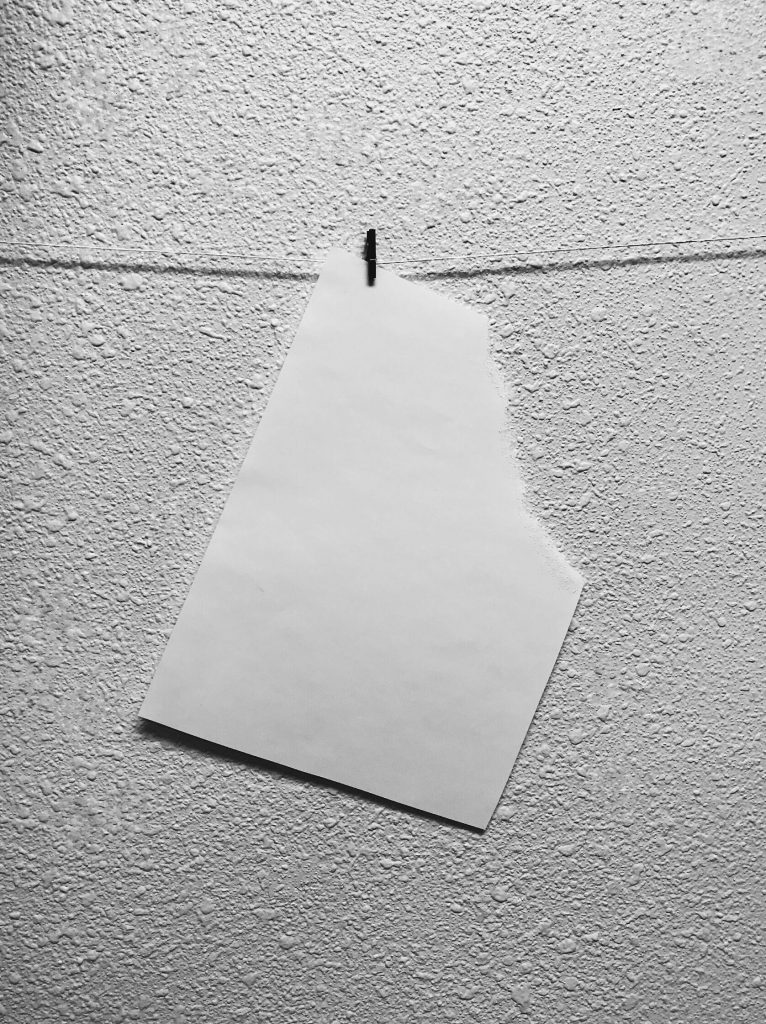
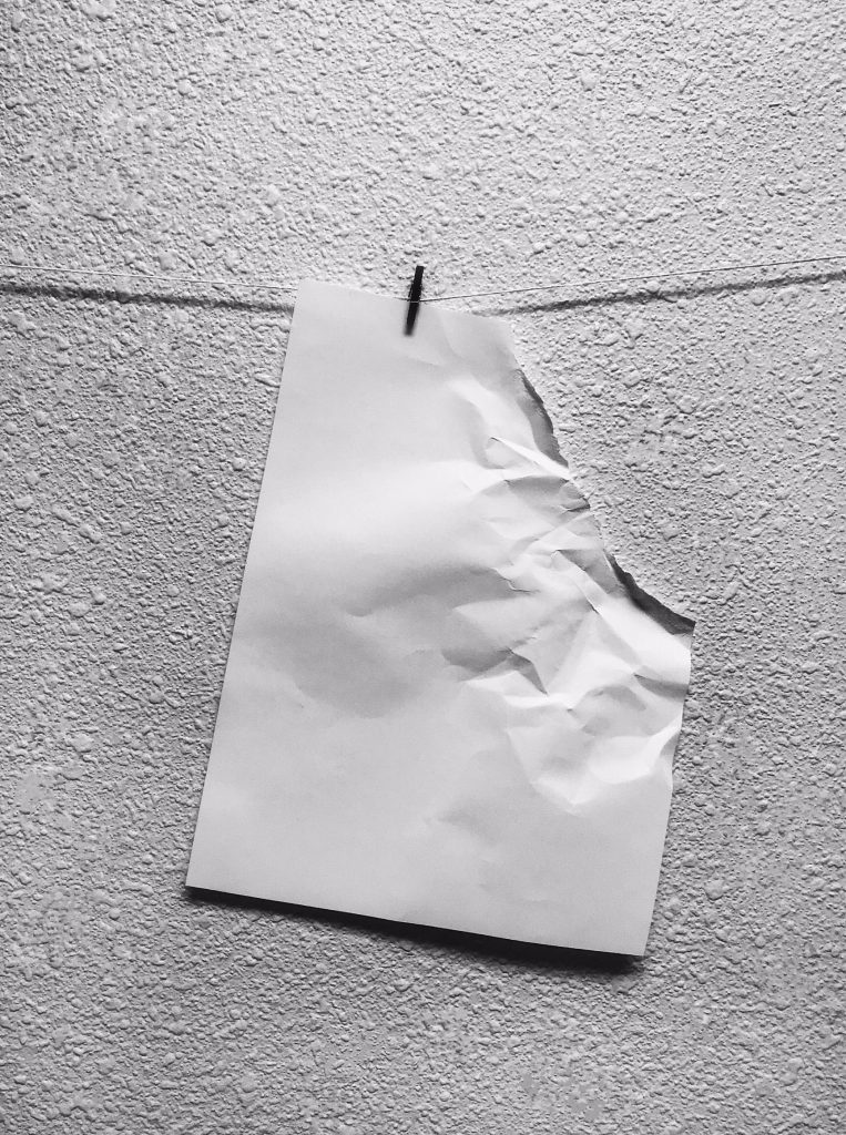
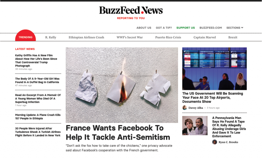
In three ideas for the editorial project, I decided to use photography for my final piece. I changed the paper into a ripped piece of paper. The first image I tear off to the corner of the paper wasn’t strange enough so I adding more wrinkle on top of it and used photoshop to let shadow darker so it protruding the image stronger.
After getting feedback from the class and needed to create the piece are horizontal than vertical. I recreated my piece into three papers on the wall. I used three different way which is torn off and crepe paper, burn the paper and smashed with scissors to damage the papers. Moreover, using three different way to destroy the paper is to represent a person has a different kind of pressure in life. Therefore, when you look are the image, each paper represents a different way of feeling.
Overall this is my first time to create an editorial illustration, I happy with my final draft turn out and how successful it is. If I have the chance to create an editorial illustration in the future, I would love to use photography to create again.
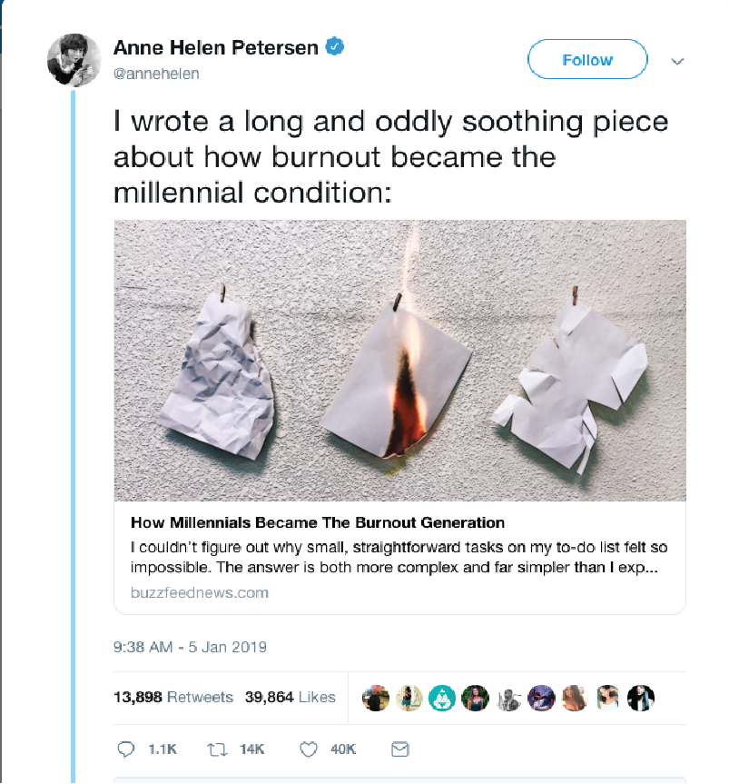


Sam here… Hi Jennifer! This one jumped out at me instantly… the use of photography and the burning paper are very effective. I personally love using a conceptual photo as an alternative to other more traditional illustration styles. It’s naturally very conceptual, and often unexpected. If I were your art director, I would be so pleased with this that I might want to push you to make it even greater. What if there were more pages? What if the pages had images of people on it? These variations could be helpful to explore. Then again, they might lead us back to your original idea, where the successive papers seem to suggest different generations? That’s a little unclear, but I still think it works. I would really love to see how you would use photography to create some spot illustrations too. A candle melted down to its bottom, etc…. but in the same look and style. Good job!