After reading the article How Millennials Became the Burnout Generation by
Anne Helen Peterson, I circulated a few ideas for sketches in my head focusing around a few phrases and words. These included ideas about how working hard is reinforced, people are optimized through how they are raised/supervised, debt, and the overwhelming sense of how much needs to be done. I eventually narrowed these phrases and words down into three sketches.

Original Sketch #1 
Original Sketch #2 
Original Sketch #3
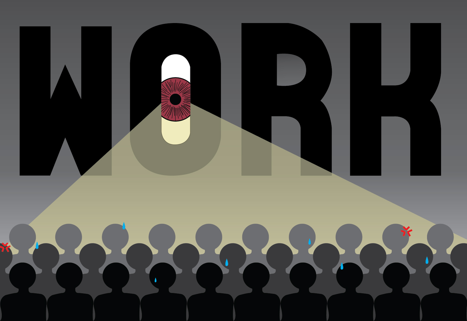
After receiving feedback from my peers, I decided to move forward and refine the third sketch that I created. I chose this one because I wanted to go with the feel that millennials are constantly working, with those in charge dictating what millennials receive from the work that they do. This idea creates a sense of supervision, which is how I came up with the idea for the eye and beam of light. I also, for this project wanted to stay away from the idea of a “never-ending list” as I found that idea cliche. I understand my illustration varies greatly from my peers, and might be a bit harder to read at a glance. However, I wanted to create something that emphasized a darker mood.
I created the illustration in a darker mood because I wanted it to appear more serious. The decision to include more figures in different shades of black and grey, it to represent that the longer a millennial works, the closer they get to burnout. While the tear drops, irritation marks, and sweat drops are to show how those figures feel about working. After more feedback, I scaled back the original gradient I had for the background, fixed the light beam, toned down the brightness of the eye, and worked more with the different emotions on the figures. I did change a few colors in the figures, but they became to bright and did not fit the overall feel I was aiming at. One thing that I could have enhanced was how my illustration worked on a smaller scale, since my figures get cutoff and lost in the post mock-ups.

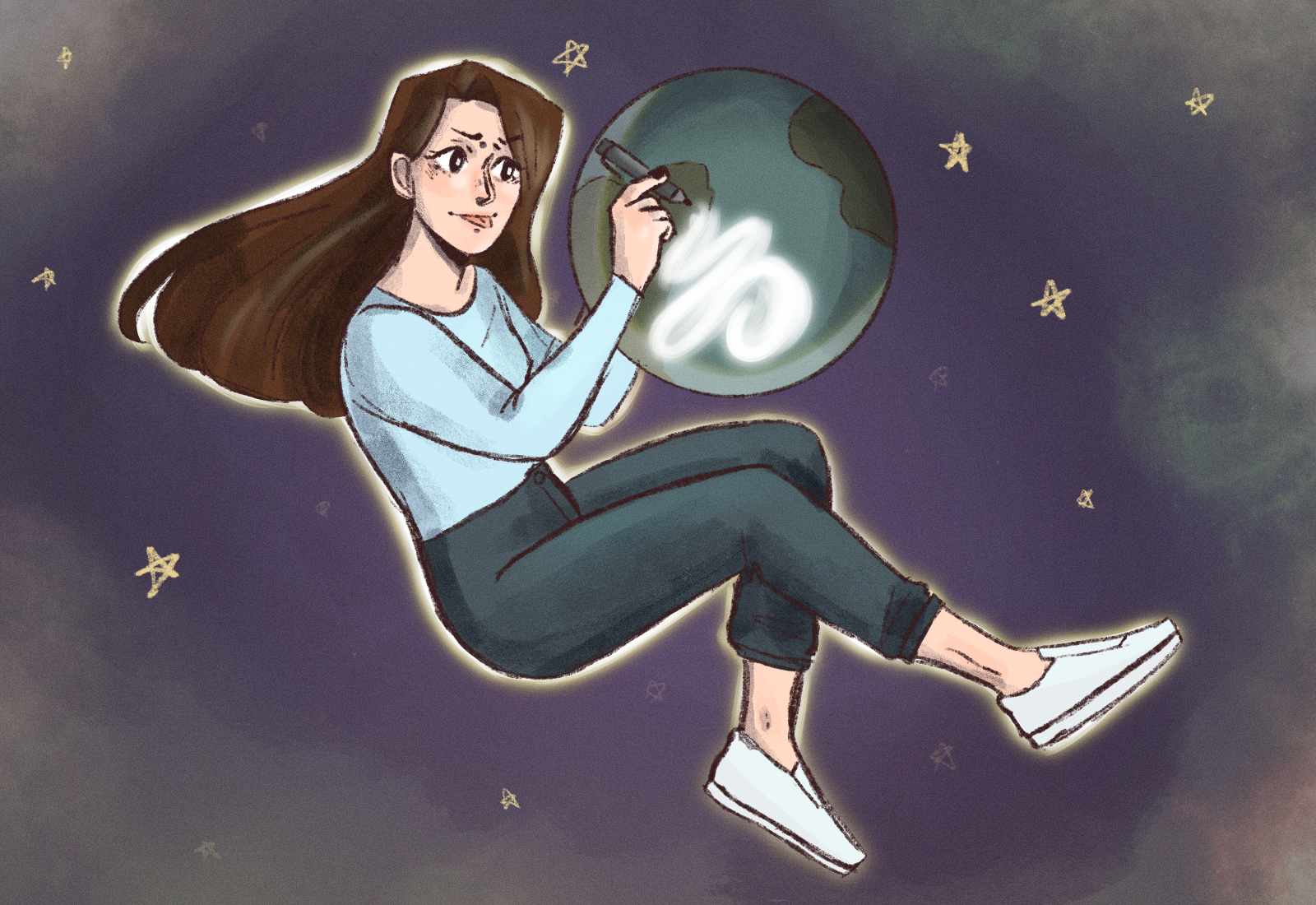
Also for this assignment, we were tasked with sketching out six more ideas for complimentary illustrations to go along with the front-page illustration.

Sketch #1 
Sketch #2 
Sketch #3 
Sketch #4 
Sketch #5 
Sketch #6
Overall, I was challenged while working through this project. I took a different route than I normally would by making text a main focal point. Another thing that was challenging was that after reading the article, I realized I was experiencing burnout myself, and found myself in a lull that I struggled to pull myself through. However, through all that, I created an illustration that I am generally pleased with and in a style that appeals to me.


Sam here. Hey Emma, good job! The impact of this one is immediate and clear. Great work there (… work… ha). Sometimes clients don’t want a lot of type and lettering in the solution– it can be too easy a solve. That’s something just to keep in mind. Maybe the letters in WORK are even bigger, and going off the frame, so you still know it says WORK if you look at it, but it’s not distracting from the other type and text in the layout of the site, newspaper, etc surrounding the piece. For the spot illustrations, I would love to see you try to incorporate the watching eye into other scenarios. That runs the risk of suggesting the article is about surveilance (Big Brother etc), but there might be away to explore that so that the spot illustrations really connect to the style of the main piece, which is often the goal and can make for an impressive set of images together.