This assignment was seen as a editorial commission project. The illustration that was created would be the featured image of Anne Helen Peterson’s article, “ How Millennials Became The Burnout Generation”. It also required six other sketches that could potentially be used as complimentary illustrations for the rest of the article.


Going into this assignment, I thought it would be a piece of cake (boy was I wrong!). I soon realized summing up an entire article in one illustration is not as easy as it may seem. I was challenged with the idea of coming up with simplicity yet getting to the point. After hearing Sam Smith talk, I knew that I didn’t want the editorial illustration to contain too much, yet I wanted to be able to summarize the article enough.

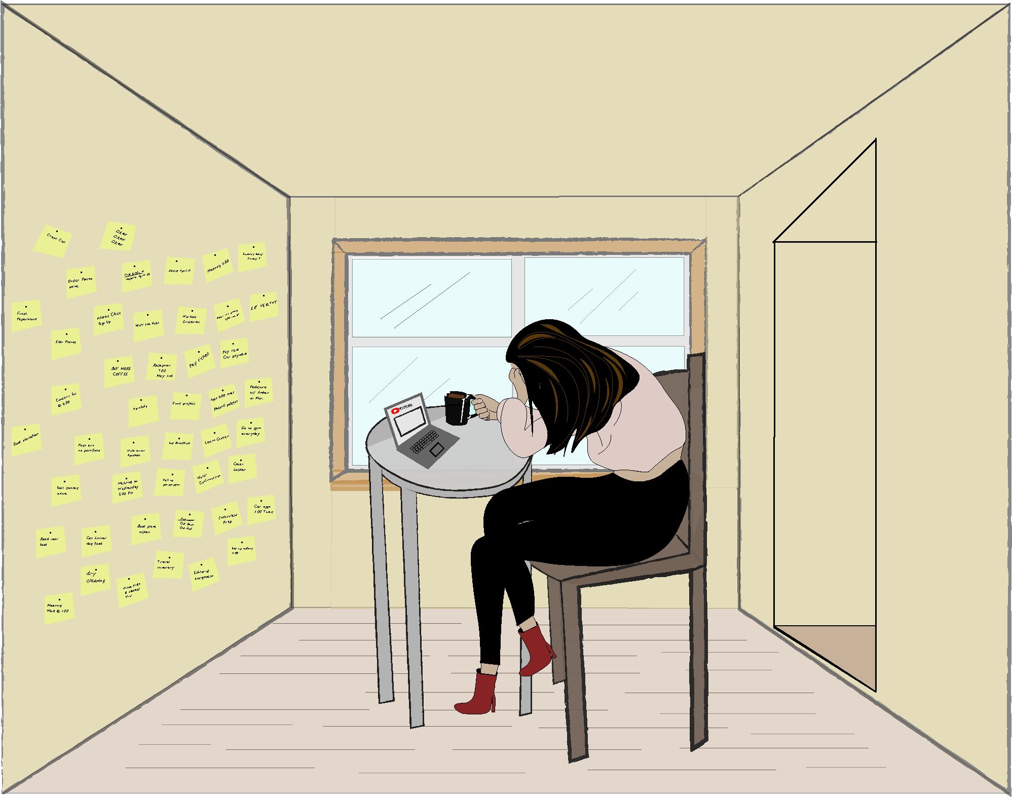
I first started off with the idea of electronics (because lets be real every millennial is obsessed), but it came out too vague and not to the point. I then aimed for a to do list being burnt which I felt would iterate the idea that Peterson was trying to convey of the burnout. The more I thought of it however, I realized that I wanted something more relatable and I also wanted to introduce comedic relief (which was such a challenge for me that I feel like I tackled well!). Hence, the coffee light turned on! Being a millennial myself, I know how a day that goes on and on with millions of things to do can feel and sometimes the only thing that gets you through is a cup of coffee.


Playing around with a few ideas and hearing what others had to say in critique, I finally landed on a final piece. This creates the sense the article is going for because the viewer can feel the exhaustion all over the character that is slouched on the table with a coffee in her hand. The laptop is also put out to show that although she has so much to do, the character chooses to watch YouTube instead. The post it notes on the wall are referring to Peterson’s idea of errand fatigue and how burnt out the character in the piece is. The minimalistic, almost dull, color palette of the character herself also suggest this feeling of overall exhaustion. As the viewer can see, it is a beautiful blue day outside but the character is stuck inside completing the to-do lists. Movement was created using the hair and putting texture into the windows.

Overall, I felt that after my revisions and listening to others advice, I did really well on this assignment. Like I said I was challenged a lot in the beginning with creating a simplistic yet reasonable design. I also wanted to challenge myself with the comedic relief idea that all millennials need coffee to keep going. I felt that I did well tackling both of these challenges and really giving this project my all. I continued to challenge myself at the end of the project as well when I created the six complimentary designs that could potentially be seen in the article along with the final. I felt that I did a good job conveying the theme with each of these sketches.


Sam here… Nice, Julia! The composition, with the window in the middle and the walls almost closing in on the character, is very eye catching. The head in the coffee, the list, the post its, and the YouTube are great inclusions. My only suggestion would be to push them all more. The YouTube on the laptop is too tiny to really register, so that might work best in an over-the-shoulder shot of her at a desk, surrounded by to-dos. Maybe there could be post its on ALL the walls, maybe even more lists on the ground. I know you’re going for a more minimal style without too much detail, and that’s great! But the way to think about it is that you want to really PUSH the things that you’re pushing. If the idea is a lot of post-its, make a LOT more post-its. If the pretty day outside is meant to be a contrast, make it even MORE of a contrast. Exaggerating the impact of each item can really help make the concept hit even faster and harder for the reader. Nice work.