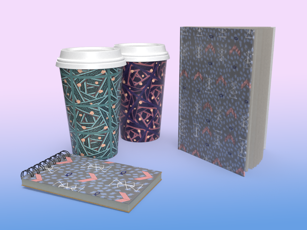
This project was all about surface design and making a compelling pattern with an intended audience. I am typically drawn to geometric patterns but also something that is loose and organic as well. I think going into this project I had a good understanding of the pattern I wanted to experiment with. I draw little patterns all the time and one that would always come up in my sketches is multiple lines overlapping with each other. The first hero pattern is what demonstrates this idea. I intend my audience to be for college campus supplies like notebooks or agendas. Another area I would like this pattern on is things like coffee sleeves or mugs sold on campus.
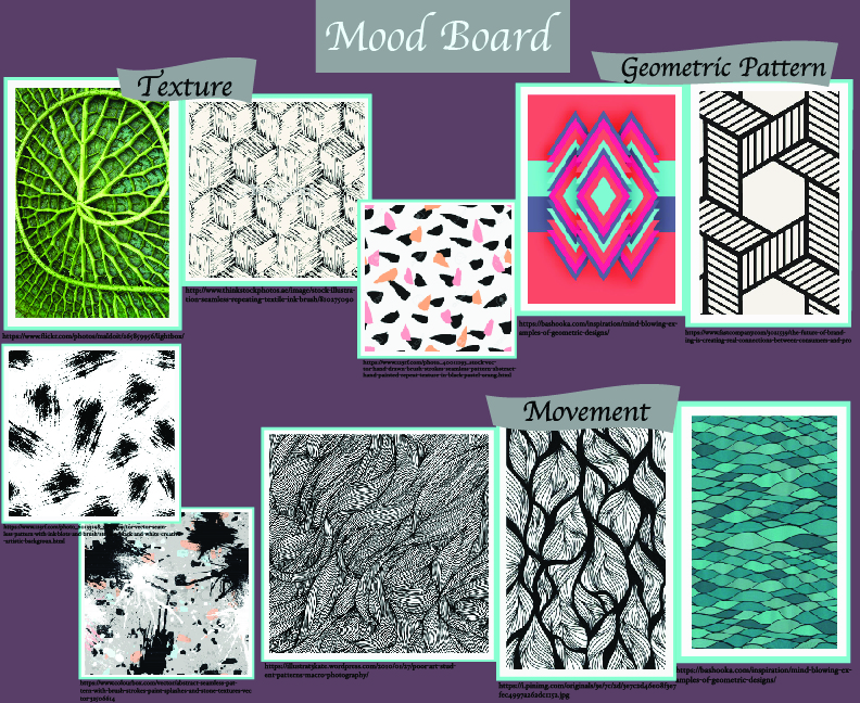
After making a mood board, I was able to see the designs and little pattern elements that I am drawn to. I had a lot of organic patterns on my mood board and I didn’t show a lot of geometric patterns, but they were something that I enjoyed drawing the most. I also liked the vibrant colors that I found in the patterns on my mood board. Having my mood board to look back to for inspiration, I was able to work it out on paper of what I wanted, which was both organic but also solid shapes.

Hero Pattern 
For my hero pattern, I liked that I was able to keep things solid and geometric with this design. I also mentioned before that I like things a little lose too and I think the little circular blobs achieved that look. They add a little more fun and randomness to the very intense straight lined pattern. My intentions for the two color schemes that I came up with was to give the pattern a freeing look and makes it a little less intense because they are brighter colors.
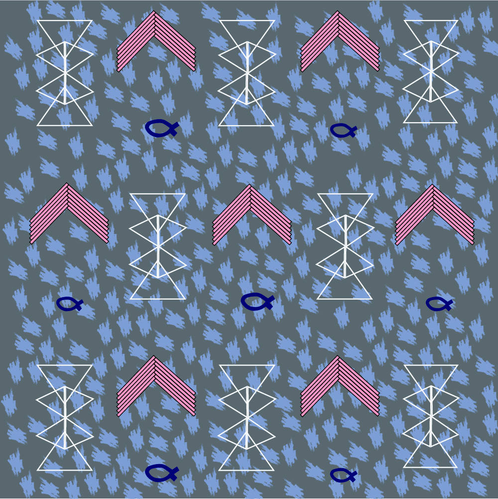
My secondary pattern also had some geometric elements in it that I enjoyed making. I kept this pattern a little less intense, leaving out some of the geometric focus. I wanted there to be some sort of texture in this design, so I created a brush marking that was repeated over and over in the background. I thought the contrast of light colored, geometric objects on the more monotoned background with texture was an interesting turnout and I ended up enjoying how that looked. The bright objects also grab focus to the rest of the pattern which is darker and may not be as eye-catching.